Typography
How to?
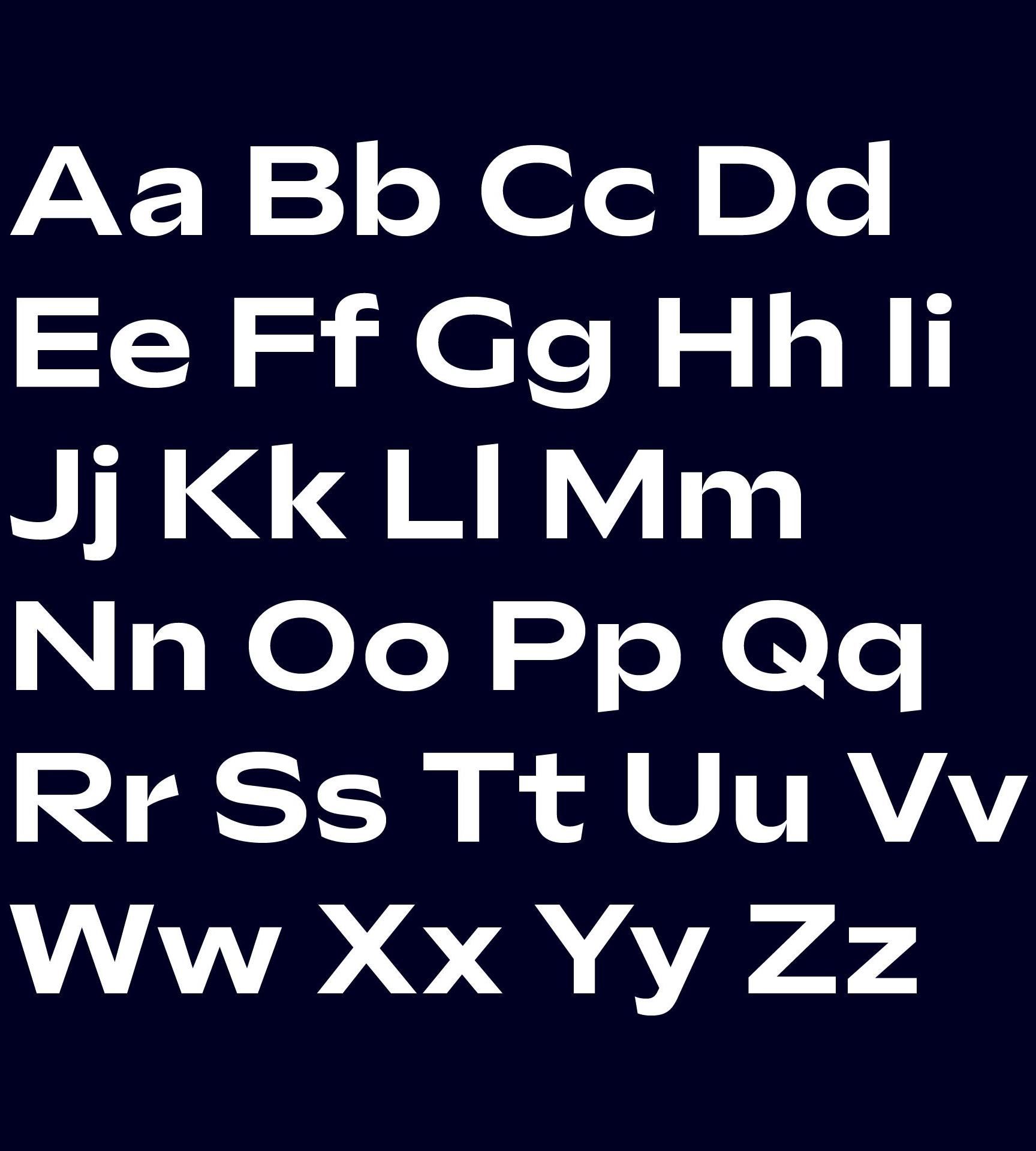
The "Sculpin" and "Inter" font families are an important and brand-defining component of The Mobility House's visual identity. A consistent yet flexible use of the typefaces creates exciting contrasts and defines the typographic character of the brand.
Fonts
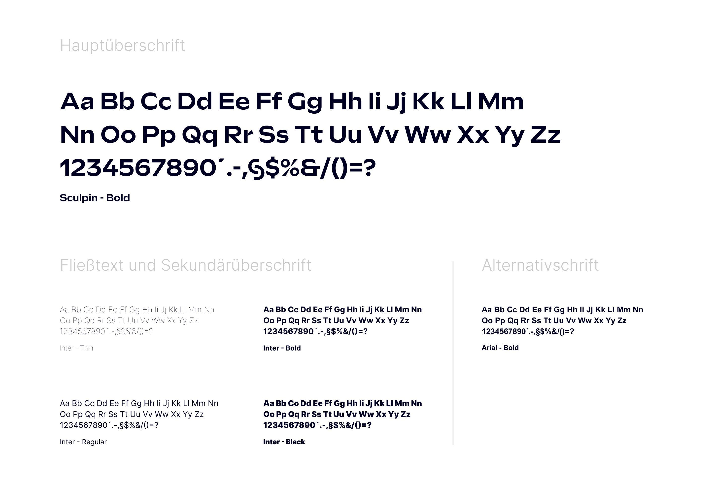
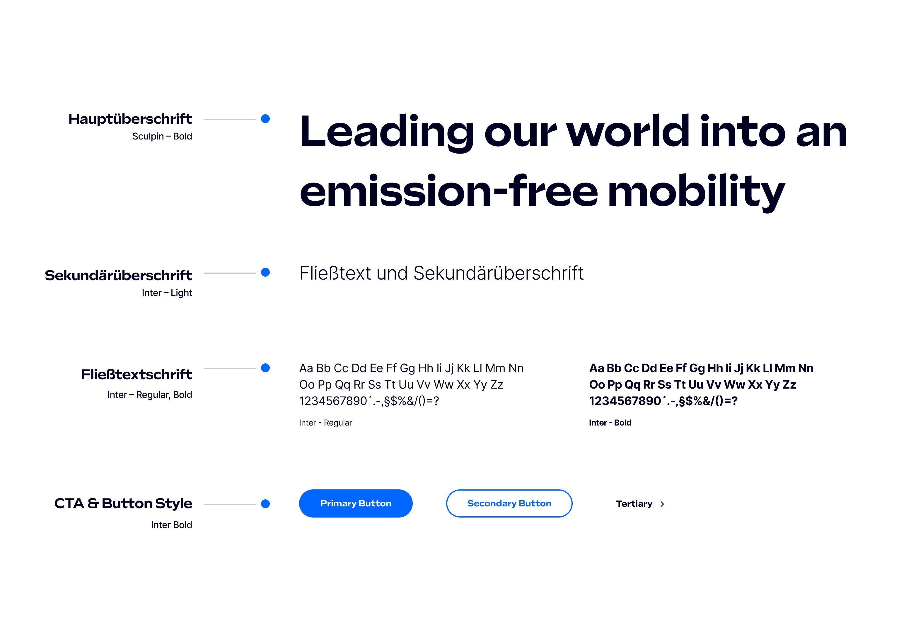
The brand image includes two fonts: "Sculpin" and "Inter". The "Sculpin" font is primarily used for main headlines.
Our main typeface is "Inter", an exuberant geometric-humanist typeface that enjoys tension, especially its own tension between round and rectangular shapes.
Inter" is also used as a secondary headline and is therefore used almost everywhere.
We use four weights from the Inter font family and one from the "Sculpin" font family. Thin, Regular, Bold and Black may be used for the "Inter" and Bold for the "Sculpin". Such a versatile family offers various design solutions, from brochure design to poster design, from branding to signage systems and more.
If the "Inter" font is not available, I may also use the "Arial" system font in exceptional cases.
Last updated: April 2024