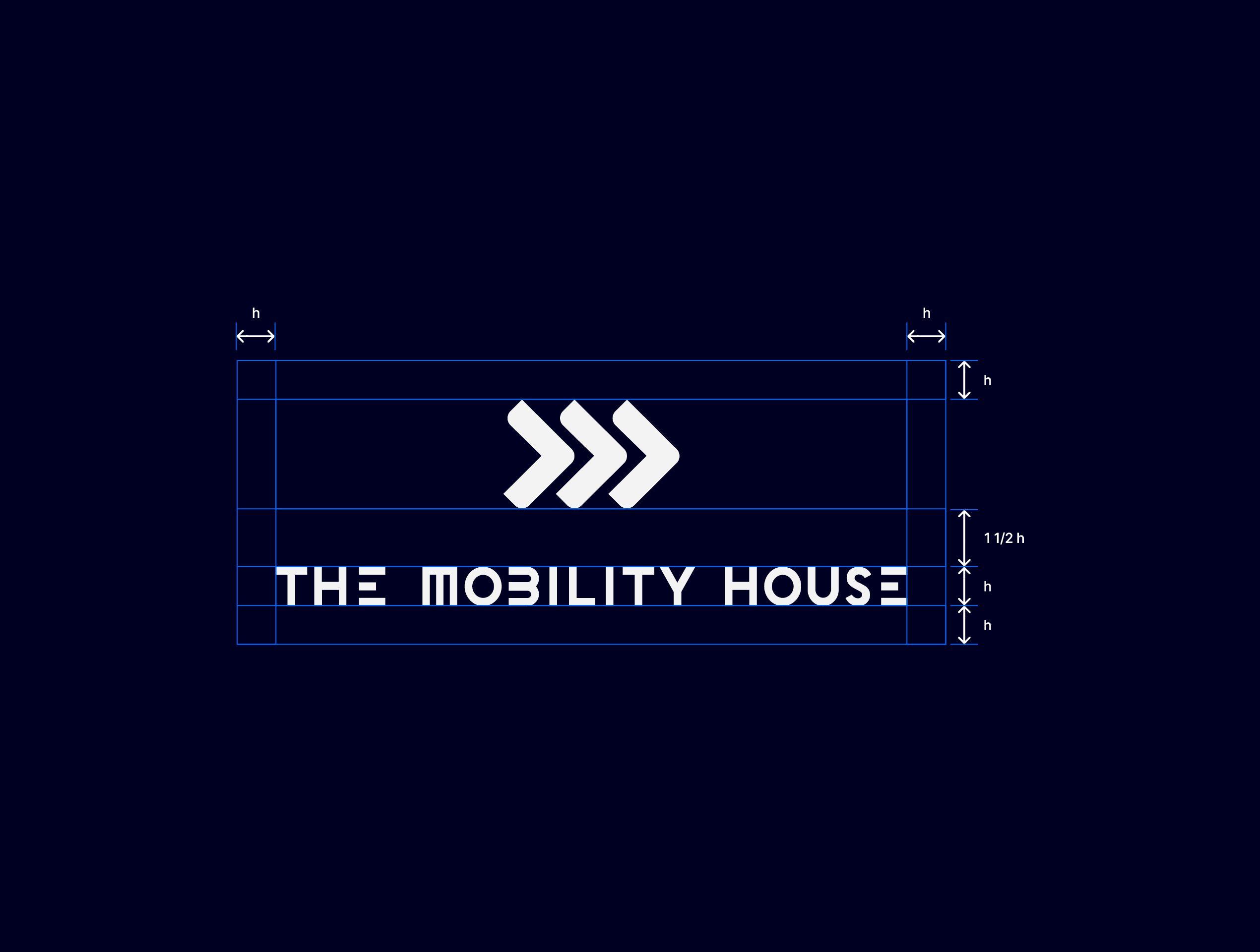
The Mobility House Logos
The logo represents the brand to the outside world and stands for a strong and self-confident appearance. It offers flexibility in all media and proves itself in both analogue and digital areas.
Usage
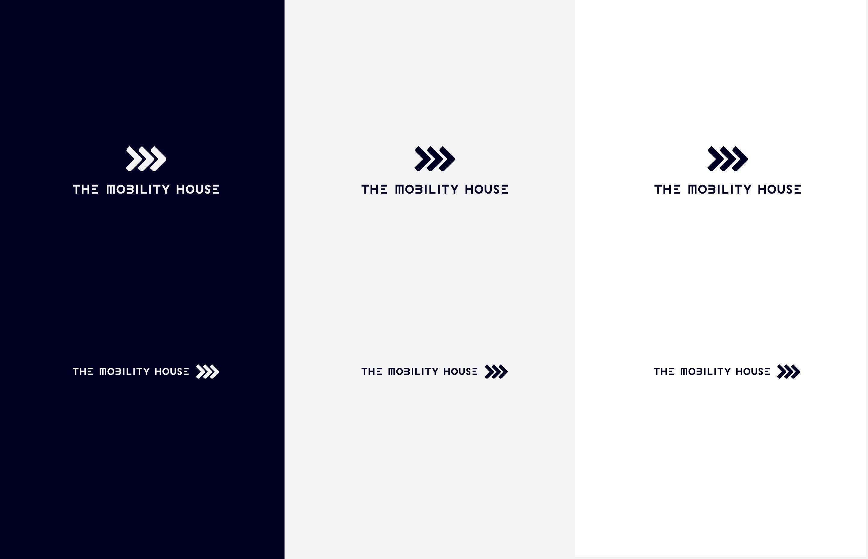
The Mobility House logo appears in the colours "Ghost grey" and "Deep blue". The shape and colour scheme of the logo is its shape and colour scheme and may not be may not be changed. Therefore modifications such as distortions, garnish and the like are prohibited.
White space & minimum size
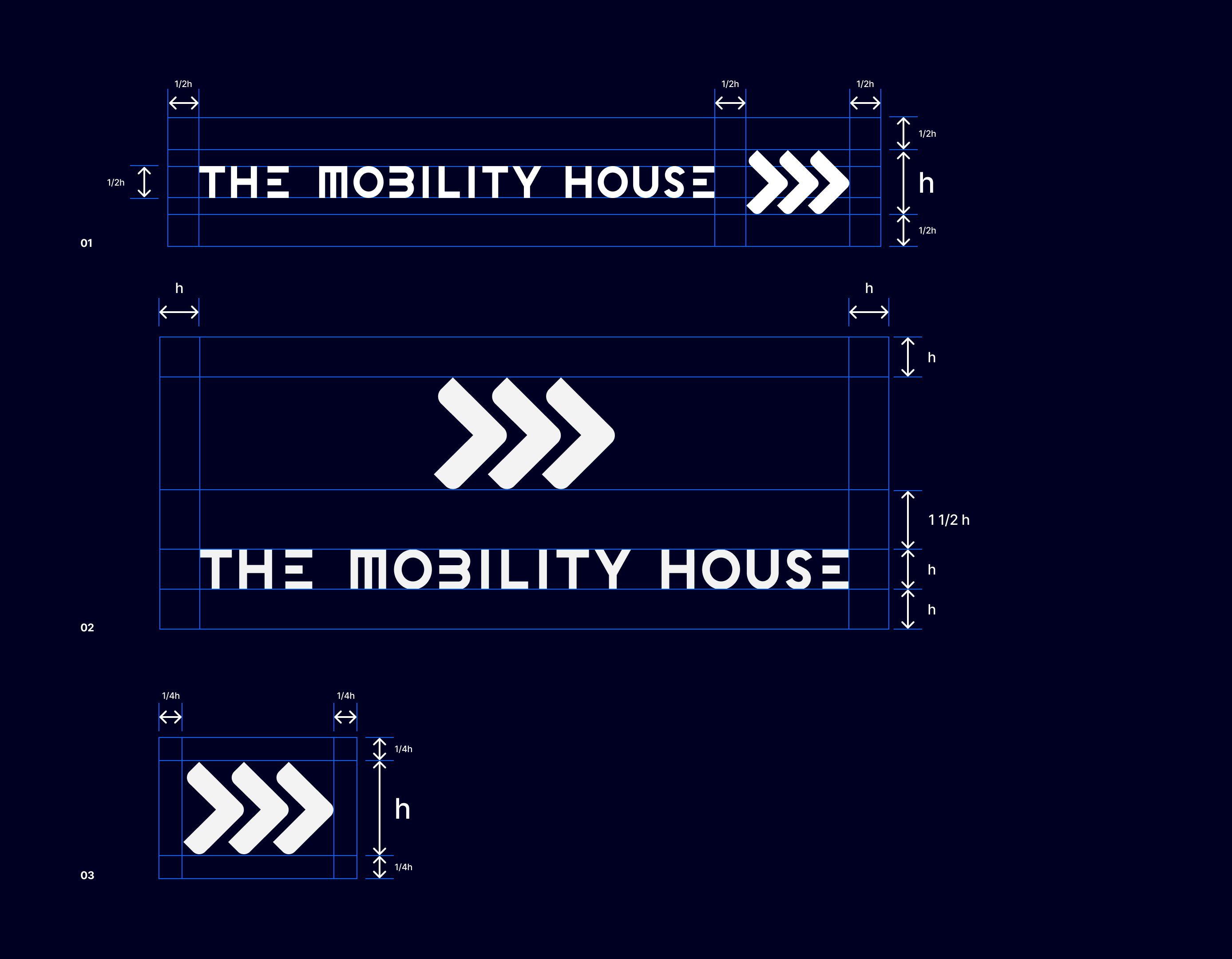
If you use the logo with other graphic elements, you should make sure that you give it some space to breathe. This free space, also known as white space, runs all the way round the logo. The logo height specifies the minimum distance between the logo and other graphic elements.
(To ensure that the logo retains its visual impact, it should not be smaller than 18 pixels in height or 80 pixels in width).
01 Horizontal logo with white space
02 Vertical logo with white space
03 Symbol with white space
Placement
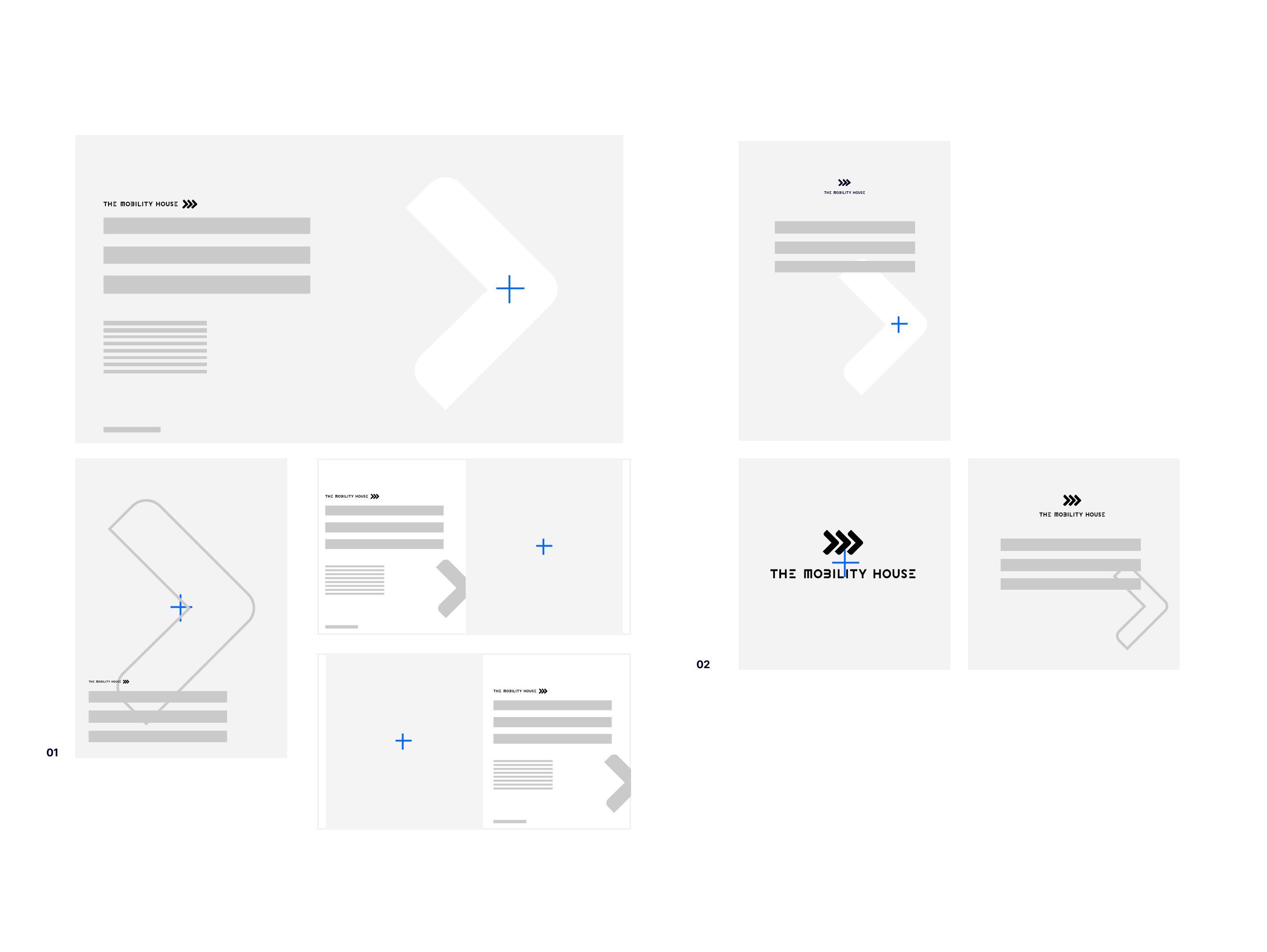
If possible, the logo should be placed on the left-hand side of the layout with enough space for headings and text. Sometimes, however, it is necessary to give the rest of the content more space and place the logo elsewhere. Here are some examples for this scenario.
01 Logo left-aligned
02 Logo centered
Ready to use?
Last updated: April 2024
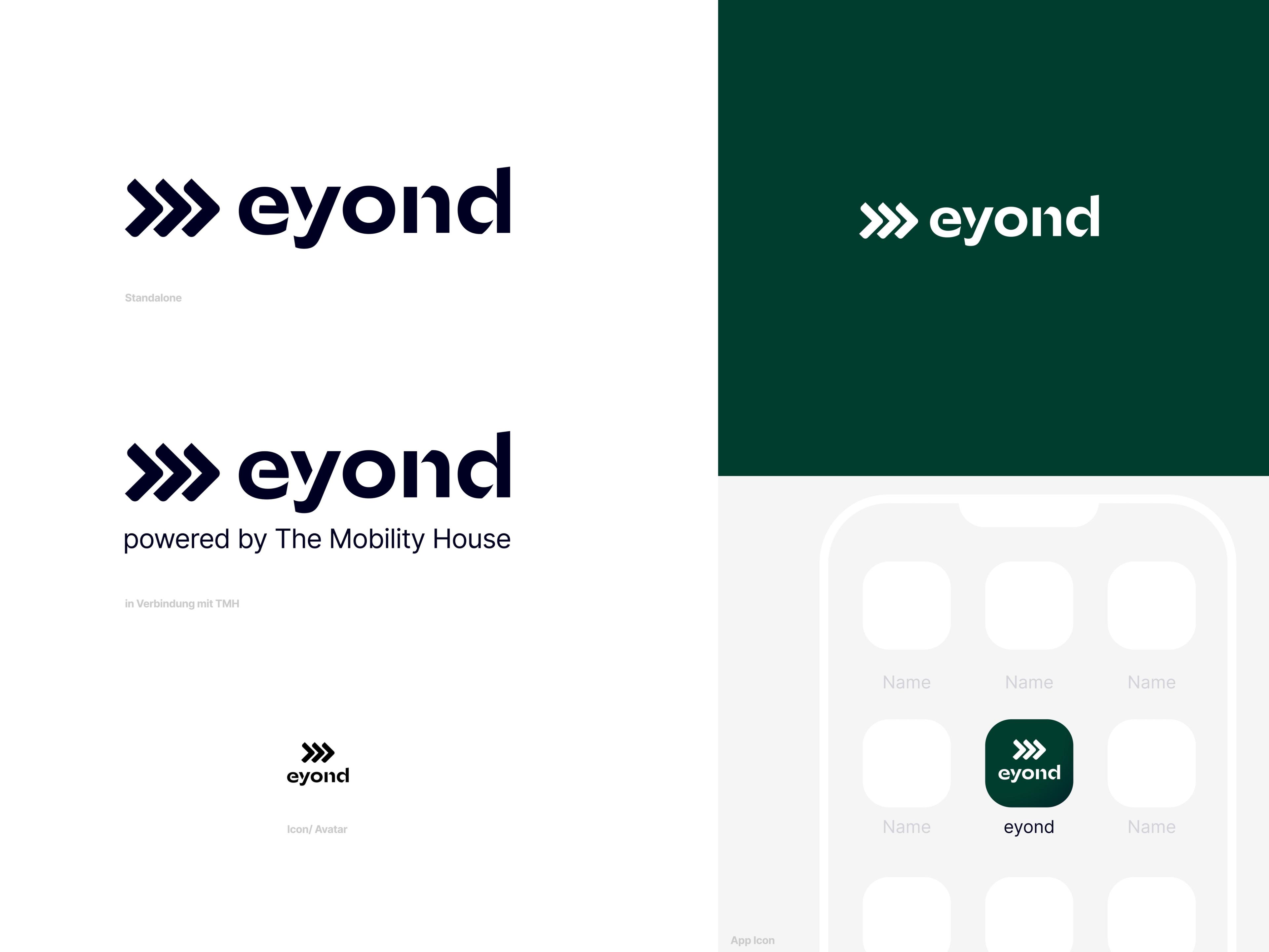
eyond Logos
The eyond logo fulfils all necessary requirements:
-
Clear and unambiguous connection to the TMH umbrella brand through
a) Integration of the TMH figurative mark
b) Taking up the stencil font style of the TMH word mark - At the same time, enough independence to eyond as a product brand with its own brand with its own presence (website, social media) to be able to market
- Modern, clean, appealing
- Systematic approach to other products (e.g. ChargePilot®) transferable
- Scalable in various sizes Scalable in various sizes
Ready to use?
Last updated: April 2024
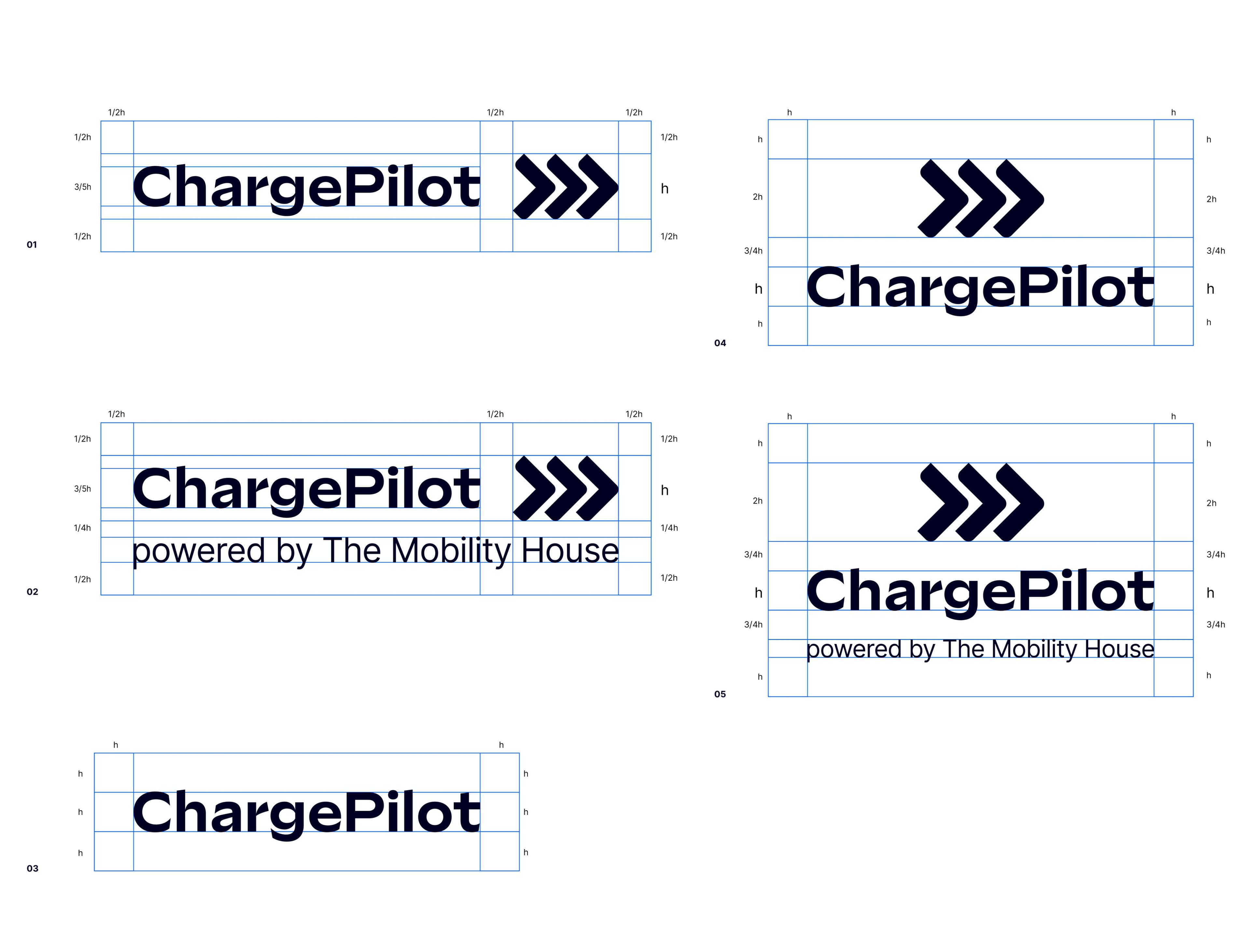
ChargePilot Logos
Use of the corporate typeface Sculpin.
Integration of The Mobility House logo imagemark.
Optional "powered by The Mobility House" tagline depending on the use case.
Creates reference to The Mobility House logo universe (E-Mobility Assistant logo, eyond logo).
01 Logo
01 Horizontal
02 Horizontal with tagline
03 Wordmark
04 Vertical
05 Vertical with tagline
Ready to use?
Last updated: April 2024